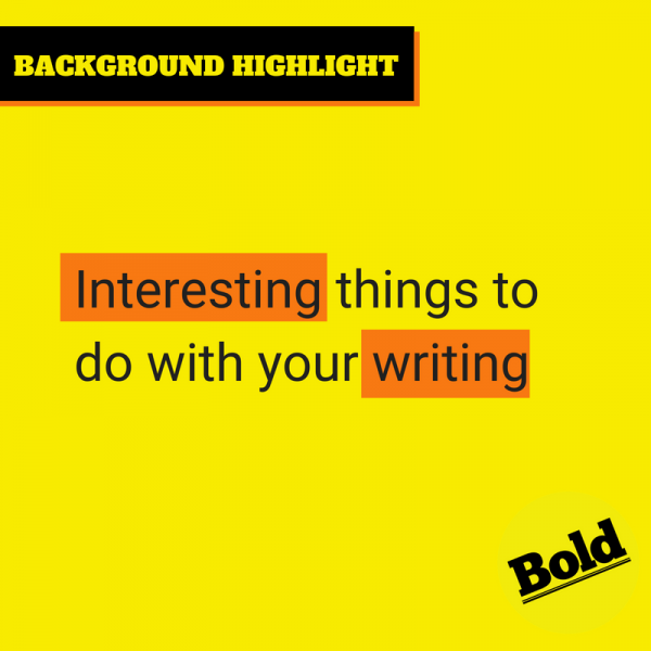
Let’s face it, we’re all expected to be graphic designers these days. With the array of free-to-use tools out there, creating a social media visual takes minutes.
Let’s face it, we’re all expected to be graphic designers these days. With the array of free-to-use tools out there, creating a social media visual takes minutes.
That doesn’t mean our designs always look good.
There’s one sure way to tell the real deal from the amateur in terms of design aesthetic, and that’s how you can style text better.
Our suggestions to style text better are easy and look professional, even if you’re not a designer.

Take the first step towards digital success and let’s start driving results.
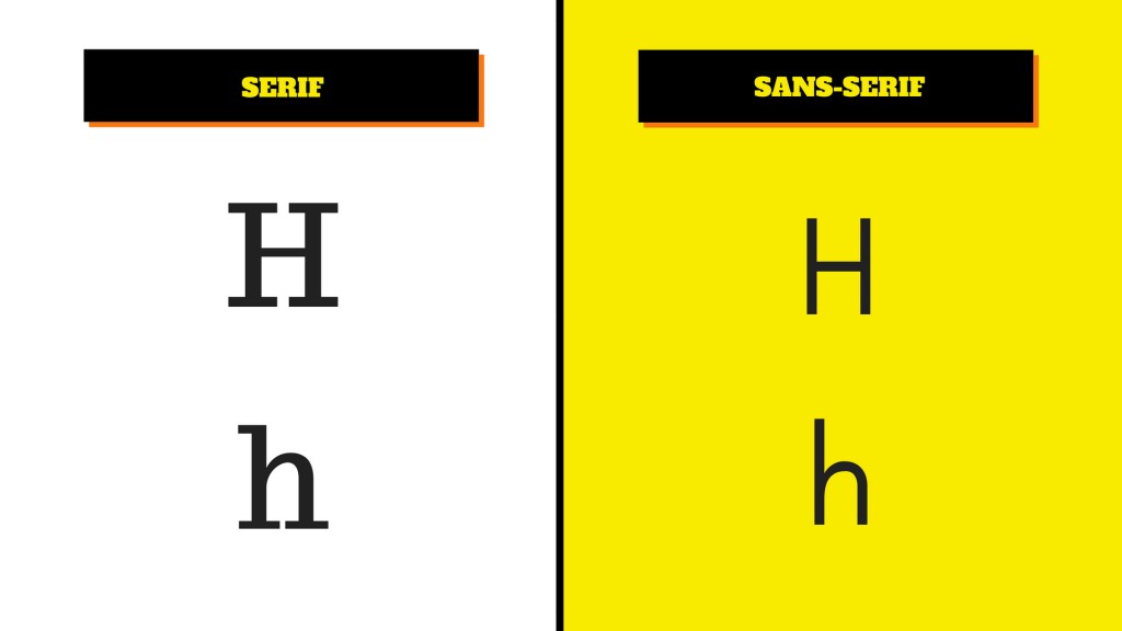
Font pairing is a minefield and not an activity for the faint-hearted. If you are interested in mixing two fonts, save time deciding and instead use a tool such as Canva Font Combinations.
However, for very basic guidance, why not start off with a script font combined with a san-serif font?
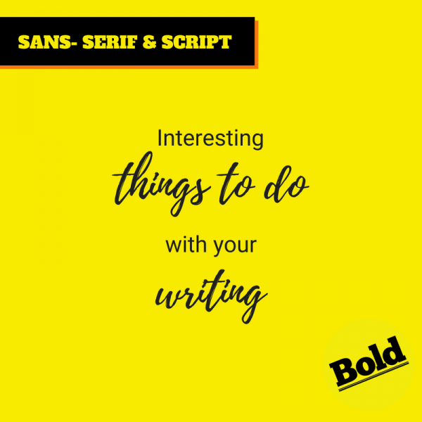
A script font looks as though it has been written by hand.
The example below uses Playlist Script and Roboto.
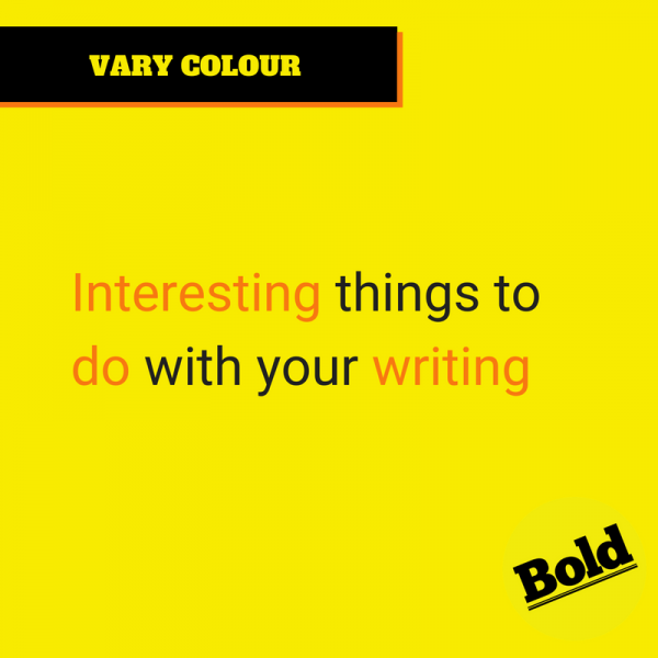
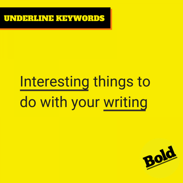
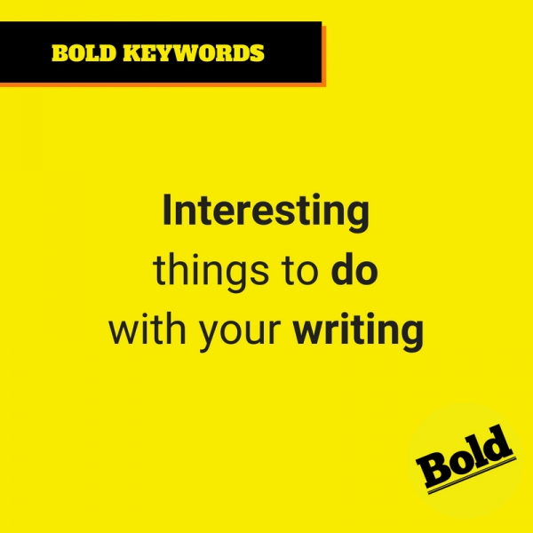
A simple but effective method, and indeed one used in much branding currently, is highlighting keywords in a phrase.
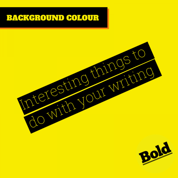
You have various options; the most common are making the keyword bold, underlining it, giving it a different font colour or a background colour.

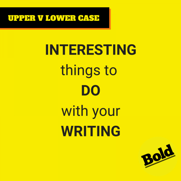
Of course, sometimes all you might want to do is capitalise the important items.
Recent trends have offered us text that looks like it’s been stuck on by tape. Designers sometimes choose to display this over images, and it lends a rather vintage look from the cassette era.
These are some simple ways to establish elegance within your design without spending hours tweaking it. Have a go adding some of them to your own designs to see which you prefer.