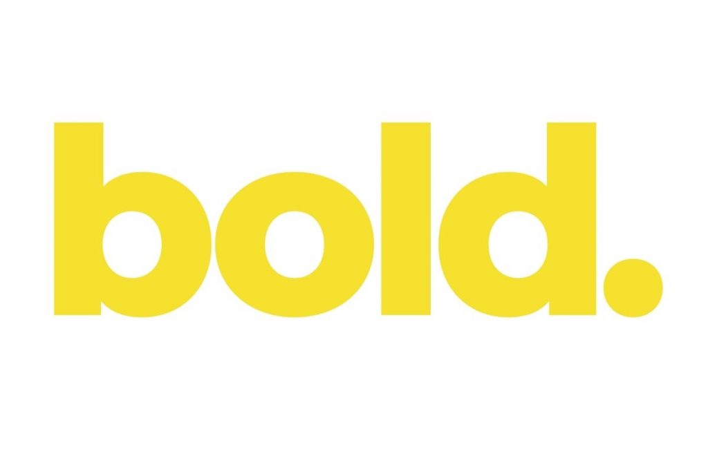
We have a new identity! We are proud to announce the launch of our new logo as part of our 10-year celebrations at Bold – which we thought was the perfect time to evolve our brand.

Back in 2013, Bold was born. First starting out as a social media agency, it’s safe to say that many people didn’t believe in our business plan. This is simply because social media just wasn’t as mainstream as it is now.
Businesses couldn’t understand why they would need to pay an agency to manage their social media for them – but we believed in it when no one else would.
Since then, we have introduced many more services in order to build our client offerings such as website development, branding design, blogging, PPC campaign management, SEO, email marketing and so much more.
With 10 years in business, more than 114 websites under our belt and 100s of clients who trust us, we thought it was time for a little change of our own…

Get your free digital marketing quote
Take the first step towards digital success and let’s start driving results.
Say goodbye to our previous logo…
With Bold continuing to grow and evolve over the last 10 years, we felt it is now time to adapt. We have altered our logo to reflect who we are today and to symbolise our exciting future.
Bold’s old logo did a great job for our beginnings and has served us well over the last 10 years, but the time has come to move on.
We’ve taken the time to refresh elements of our logo to display a more clean and more modern style whilst retaining our bold and results-driven nature!
We feel that our new changes show who we really are a lot better, such as our logotype face set in “Montserrat Extra Bold” coupled with the strong statement of a full stop (a little nod to the yellow circle in our previous logo). Our yellow is set to a warmer tone but it’s still a vibrant colour when paired with our black.
So, let’s take a deeper dive into the new elements of our brand…
Typeface
Say Hello to our new typeface – Montserrat Extra-Bold!
When choosing a new font to use, we were drawn to the fun and geometric letterforms of this typeface. We loved the strong and refined lines but also felt it gives a sense of warmth and energy – which is exactly what we wanted in order to portray our personalities and values at Bold.
Colour
Not everything has to change drastically!
We have decided to choose a slightly different shade of yellow that edges more towards a warmer tone. Although this shade of yellow isn’t as vibrant, we feel that the warmer tone still creates just as much of a vibrant impact.
Here at Bold, we like to stand out. Which is exactly why we chose this new colour!
Lower case
Notice how we’ve cut out the capital “B”?
We feel that the new, lowercase look, signals familiarity. It says: “We know each other and don’t need to be fancy.”
Lowercase text can read as honest and approaching – very much like our team here at Bold.
Shorter name
“Where did the ‘online marketing’ go?” you might ask…
Although you might think that we need these extra words to define who we are, that’s not how we see it. Would you call a friend by their full name 10 years down the line? Didn’t think so.
We’ve gone for a more short and snappy version and dropped the formalities (since we know each other so well now), so just call us Bold!
Over the next day, you’ll see our other visuals around Bold aligning with this new logo: on the website, in advertising, on our socials and in any other communication methods.
But don’t worry – it’s still us. We’re still Bold!
